Image
The Image component is used to display images with added options for cropping.
Import
Usage
Editable Example
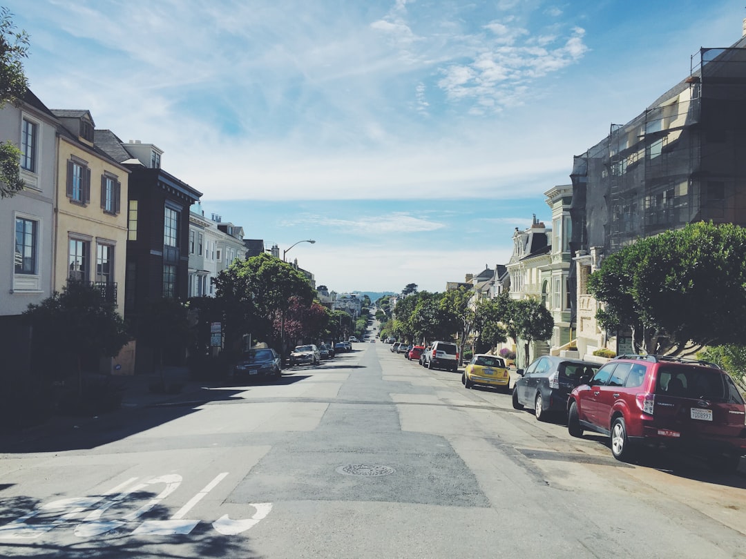
Force an aspect ratio
This is useful if you want to crop the image or you don't know the dimensions of an image.
Editable Example

Change image on hover
You can also provide an additional image under hoverSrc to change image on hover.
Editable Example
Props
| Name | Type | Default | Description |
|---|---|---|---|
src | string | The path to the image source. | |
hoverSrc | string | The additional image to show when hovering. | |
alt | string | The alt text that describes the image. | |
onLoad | function | A callback for when the image src has been loaded. | |
onError | function | A callback for when there was an error loading the image src. | |
htmlWidth | string | number | The native HTML width attribute of the img element. | |
htmlHeight | string | number | The native HTML height attribute of the img element. | |
aspectRatio | AspectRatioProps['ratio'] | Force the image to render at a certain aspect ratio. | |
objectFit | 'contain' | 'cover' | 'fill' | 'scale-down' | 'none' | Force the image to render at a certain aspect ratio. | |
provider | 'shopify' | undefined | Enable image sizing. |